“`html
Scatter Plots in Finance: A Visual Tool for Insights
Scatter plots are a powerful, yet simple, visualization tool widely used in finance to analyze relationships between two variables. They provide a visual representation of data points, allowing analysts to quickly identify patterns, correlations, and outliers that might otherwise be missed in raw data.
Understanding the Basics
A scatter plot consists of two axes: an x-axis (horizontal) and a y-axis (vertical). Each data point is plotted on the graph based on its values for the two variables being analyzed. The x-coordinate represents the value of one variable, while the y-coordinate represents the value of the other. By plotting numerous data points, a visual representation of their relationship emerges.
Applications in Finance
Scatter plots have numerous applications across various domains of finance. Here are a few prominent examples:
- Risk and Return Analysis: One common application is analyzing the relationship between risk and return for different assets or investment portfolios. The x-axis might represent risk (measured by standard deviation or beta), and the y-axis might represent return. A scatter plot can reveal if there’s a positive correlation (higher risk associated with higher return) or if some assets offer better returns for the same level of risk compared to others. Outliers could represent undervalued or overvalued assets.
- Correlation between Stocks: Investors can use scatter plots to visualize the correlation between the prices of different stocks. This helps in portfolio diversification. If two stocks show a strong positive correlation (points cluster along an upward-sloping line), they tend to move in the same direction, reducing the diversification benefits of holding both. Stocks with low or negative correlation are preferred for a diversified portfolio.
- Interest Rates and Inflation: Economists and analysts use scatter plots to study the relationship between interest rates and inflation. This visualization can help determine if the central bank’s monetary policy is effectively controlling inflation.
- Financial Ratios Analysis: Companies can use scatter plots to compare financial ratios, such as debt-to-equity ratio and profit margin, across different periods or against industry benchmarks. This comparison helps identify trends, assess financial health, and pinpoint areas requiring improvement.
- Predictive Modeling: While not the primary purpose, scatter plots can provide a preliminary visual assessment of the suitability of linear regression models. If the data points appear to follow a linear trend, a linear regression might be appropriate to model the relationship and make predictions.
Interpreting Scatter Plots
Interpreting a scatter plot involves looking for patterns and trends in the data. Key aspects to consider include:
- Correlation: The degree to which the points cluster around a line indicates the strength of the correlation. A tight cluster suggests a strong correlation, while a scattered arrangement suggests a weak or no correlation. A positive correlation means the variables tend to increase together, while a negative correlation means one variable increases as the other decreases.
- Linearity: Assess whether the relationship appears linear or non-linear. If the points follow a curve, a non-linear model might be more appropriate.
- Outliers: Identify any points that deviate significantly from the general trend. Outliers can represent errors in the data or unique events that warrant further investigation.
Limitations
While scatter plots are useful, they also have limitations. They only show the relationship between two variables at a time and can be misleading if other factors are influencing the data. Furthermore, correlation does not imply causation. Just because two variables are correlated does not mean that one causes the other. Careful interpretation and further analysis are always necessary.
“`
 1397×819 scatter plot from docs.omnisci.com
  616×330 create scatter plot business intelligence domo from www.domo.com
 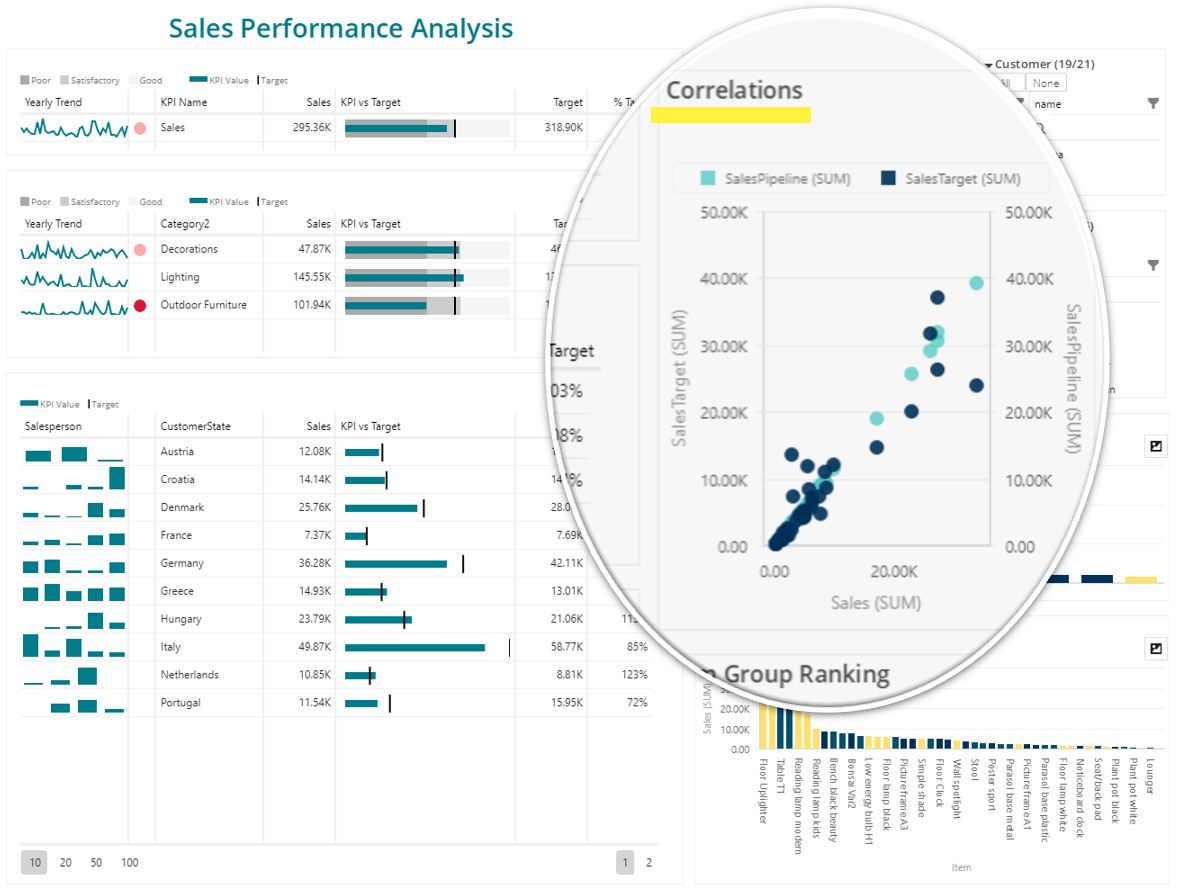 1182×889 scatter plot definition examples businessq qualia businessq from businessq-software.com